

Our new identity
Closer to you, truer to nature.
Why this change?
A new era for Endro
Since our beginnings, our mission has been to offer you the best of nature with products that are 100% natural in origin.
This change in identity was born from a desire to assert our identity with greater strength and clarity.
This new look embodies a more mature and expert vision of skincare: a perfect balance between high technicality and absolute respect for the Earth. Through this refined design, we wanted to create an inspiring aesthetic that reflects the very essence of our formulas: powerful, raw, and 100% natural nature. More than just a graphic evolution, it is an affirmation of our expertise at your skin's service.
Optimized formulas
Natural Effectiveness
The change is not just aesthetic. We took advantage of this evolution to enhance our textures. Thanks to even more refined 100% natural origin formulations, your skincare products now offer enhanced sensoriality. More unctuous and melting, our textures fuse with the skin for maximum effectiveness and renewed pleasure of use.
Today, 9 products have been reformulated:
Radiance Serum | Stability & Tolerance
We replaced pure Vitamin C with stabilized Vitamin C. Why? To guarantee untouched effectiveness from the first to the last day, even in high heat. This new form is also better tolerated by the most sensitive skin, offering radiance without compromising comfort.
Radiance Cream | Light Cocktail
Its texture has been lightened for a silky, non-sticky finish. We've boosted its formula with a trio of powerful active ingredients: stabilized Vitamin C, Astaxanthin (a powerful antioxidant), and illuminating mother-of-pearl. The result: a delicate fragrance and instantly more radiant skin.
Anti-blemish Serum | High Technicity
This product becomes our most technical formula with the replacement of certain active ingredients by more effective ones, including 3 patented ones. Thanks to the integration of these active ingredients, including a peeling active ingredient, it now offers complete action: it targets pigmentation while refining skin texture for incomparable clarity and uniformity.
Anti-aging Day Cream | Regeneration & Precision
Now presented in an aluminum tube, its texture has been reworked for perfect hold. Its formula has been upgraded with the integration of Retinol-like and Peptides, reference active ingredients to boost collagen production and skin elasticity, 100% naturally.
Jar Deodorants | Freedom & Stability
The revolution of the gesture. We have improved the texture so that it remains easily scoopable with a finger throughout the year, never melting during heatwaves. This technical challenge allows us to definitively remove the spatula for more intuitive and nomadic use.
Redesigned packaging for you
Design & Ergonomics: usability for efficiency
Every container has been designed to simplify your ritual. From the new, more hygienic and portable tube format to the more ergonomic jar, we've scrutinized every detail to make using our products smoother. Ergonomics at the service of your beauty, so that every treatment is a moment of serenity, without effort.
Today, 14 products are affected by a packaging change:
1. Stop Boutons: Precision in Action
Our iconic anti-blemish serum becomes Stop Boutons. We've swapped the 30ml dropper bottle for a 10ml Roll-on format, which is more practical and technical. This new format allows for ultra-targeted application directly onto the blemish, delivering the right dose and thus avoiding any waste.
2. Face Creams: The "Zero Waste" Commitment
Our 6 face creams are abandoning glass and pumps for an aluminum tube. Why this choice? For its ability to be infinitely recycled, but above all for its "zero waste" practicality. Unlike pump bottles where part of the product remains inaccessible, the aluminum tube allows you to extract all of your treatment. That means more product for you, and less waste for the planet.
3. Hand Creams: Designed for Movement
Because your hands need care everywhere and all the time, our 2 hand creams are adopting a flip-top cap. No more unscrewing and risking dropping the cap: one hand is enough to open and close your tube. The ultimate portable format.
4. Jar Deodorants: Intuitive Ergonomics
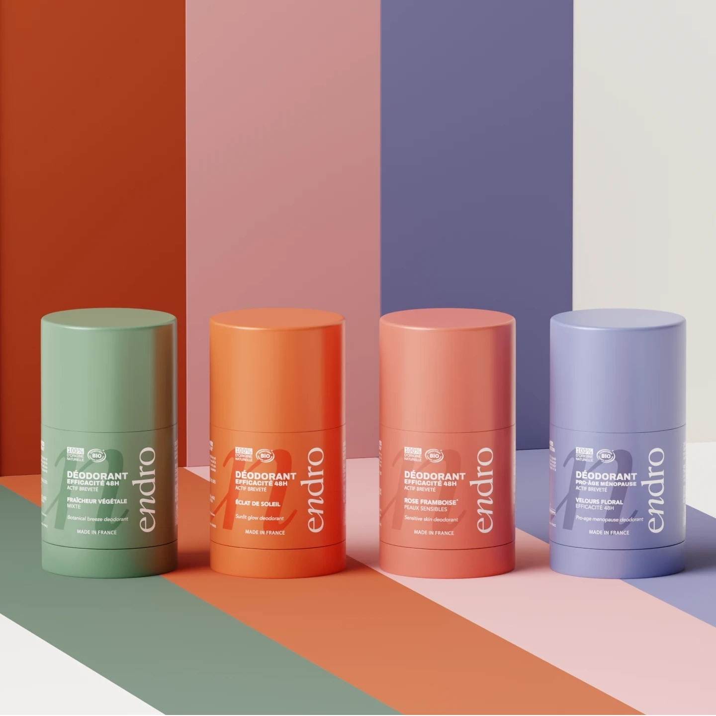
The design of our 5 deodorant jars has been completely revised. The new container is wider and shallower. This ergonomic shape, combined with our new melting texture, makes it easier to scoop with your finger right to the bottom of the jar. Optimal comfort of use, for a simplified daily gesture.
End of instruction
Why We're Turning the Page on Our Deposit-Return Scheme
For us, environmental commitment isn't just a stance; it's a constant analysis of our impact. After several years of experimentation, the data led us to a necessary conclusion: our deposit-return scheme was not the most sustainable solution.
To remain true to our values of transparency and efficiency, we decided to adopt a more concrete and less energy-intensive approach.
The Results of Our Experiment:
- An Incomplete Cycle: With a return rate of only 10%, the system failed to balance itself.
- Wasted Resources: Nearly 50% of bottles returned broken or too soiled to be reused. The intensive washing process then consumed more water and energy than anticipated.
- A Paradoxical Carbon Footprint: Transporting glass between sales points and our premises significantly increased our carbon footprint.
Our New Solution: Aluminum
This realization led us to favor aluminum, an infinitely recyclable and much lighter material. This switch to aluminum for certain products drastically reduces the energy required for transport and production, while eliminating product waste (glass often leaves an unused residue at the bottom of the bottle).
For you, it's simpler: no more need to store or return your containers. You can now recycle them directly at home, with the assurance of an efficient recovery cycle.
A new era for Endro
Since our beginnings, our mission has been to offer you the best of nature with products that are 100% natural in origin.
This change in identity was born from a desire to assert our identity with greater strength and clarity.
This new look embodies a more mature and expert vision of skincare: a perfect balance between high technicality and absolute respect for the Earth. Through this refined design, we wanted to create an inspiring aesthetic that reflects the very essence of our formulas: powerful, raw, and 100% natural nature. More than just a graphic evolution, it is an affirmation of our expertise at your skin's service.
Natural Effectiveness
The change is not just aesthetic. We took advantage of this evolution to enhance our textures. Thanks to even more refined 100% natural origin formulations, your skincare products now offer enhanced sensoriality. More unctuous and melting, our textures fuse with the skin for maximum effectiveness and renewed pleasure of use.
Today, 9 products have been reformulated:
Radiance Serum | Stability & Tolerance
We replaced pure Vitamin C with stabilized Vitamin C. Why? To guarantee untouched effectiveness from the first to the last day, even in high heat. This new form is also better tolerated by the most sensitive skin, offering radiance without compromising comfort.
Radiance Cream | Light Cocktail
Its texture has been lightened for a silky, non-sticky finish. We've boosted its formula with a trio of powerful active ingredients: stabilized Vitamin C, Astaxanthin (a powerful antioxidant), and illuminating mother-of-pearl. The result: a delicate fragrance and instantly more radiant skin.
Anti-blemish Serum | High Technicity
This product becomes our most technical formula with the replacement of certain active ingredients by more effective ones, including 3 patented ones. Thanks to the integration of these active ingredients, including a peeling active ingredient, it now offers complete action: it targets pigmentation while refining skin texture for incomparable clarity and uniformity.
Anti-aging Day Cream | Regeneration & Precision
Now presented in an aluminum tube, its texture has been reworked for perfect hold. Its formula has been upgraded with the integration of Retinol-like and Peptides, reference active ingredients to boost collagen production and skin elasticity, 100% naturally.
Jar Deodorants | Freedom & Stability
The revolution of the gesture. We have improved the texture so that it remains easily scoopable with a finger throughout the year, never melting during heatwaves. This technical challenge allows us to definitively remove the spatula for more intuitive and nomadic use.
Design & Ergonomics: usability for efficiency
Every container has been designed to simplify your ritual. From the new, more hygienic and portable tube format to the more ergonomic jar, we've scrutinized every detail to make using our products smoother. Ergonomics at the service of your beauty, so that every treatment is a moment of serenity, without effort.
Today, 14 products are affected by a packaging change:
1. Stop Boutons: Precision in Action
Our iconic anti-blemish serum becomes Stop Boutons. We've swapped the 30ml dropper bottle for a 10ml Roll-on format, which is more practical and technical. This new format allows for ultra-targeted application directly onto the blemish, delivering the right dose and thus avoiding any waste.
2. Face Creams: The "Zero Waste" Commitment
Our 6 face creams are abandoning glass and pumps for an aluminum tube. Why this choice? For its ability to be infinitely recycled, but above all for its "zero waste" practicality. Unlike pump bottles where part of the product remains inaccessible, the aluminum tube allows you to extract all of your treatment. That means more product for you, and less waste for the planet.
3. Hand Creams: Designed for Movement
Because your hands need care everywhere and all the time, our 2 hand creams are adopting a flip-top cap. No more unscrewing and risking dropping the cap: one hand is enough to open and close your tube. The ultimate portable format.
4. Jar Deodorants: Intuitive Ergonomics
The design of our 5 deodorant jars has been completely revised. The new container is wider and shallower. This ergonomic shape, combined with our new melting texture, makes it easier to scoop with your finger right to the bottom of the jar. Optimal comfort of use, for a simplified daily gesture.
Why We're Turning the Page on Our Deposit-Return Scheme
For us, environmental commitment isn't just a stance; it's a constant analysis of our impact. After several years of experimentation, the data led us to a necessary conclusion: our deposit-return scheme was not the most sustainable solution.
To remain true to our values of transparency and efficiency, we decided to adopt a more concrete and less energy-intensive approach.
The Results of Our Experiment:
- An Incomplete Cycle: With a return rate of only 10%, the system failed to balance itself.
- Wasted Resources: Nearly 50% of bottles returned broken or too soiled to be reused. The intensive washing process then consumed more water and energy than anticipated.
- A Paradoxical Carbon Footprint: Transporting glass between sales points and our premises significantly increased our carbon footprint.
Our New Solution: Aluminum
This realization led us to favor aluminum, an infinitely recyclable and much lighter material. This switch to aluminum for certain products drastically reduces the energy required for transport and production, while eliminating product waste (glass often leaves an unused residue at the bottom of the bottle).
For you, it's simpler: no more need to store or return your containers. You can now recycle them directly at home, with the assurance of an efficient recovery cycle.


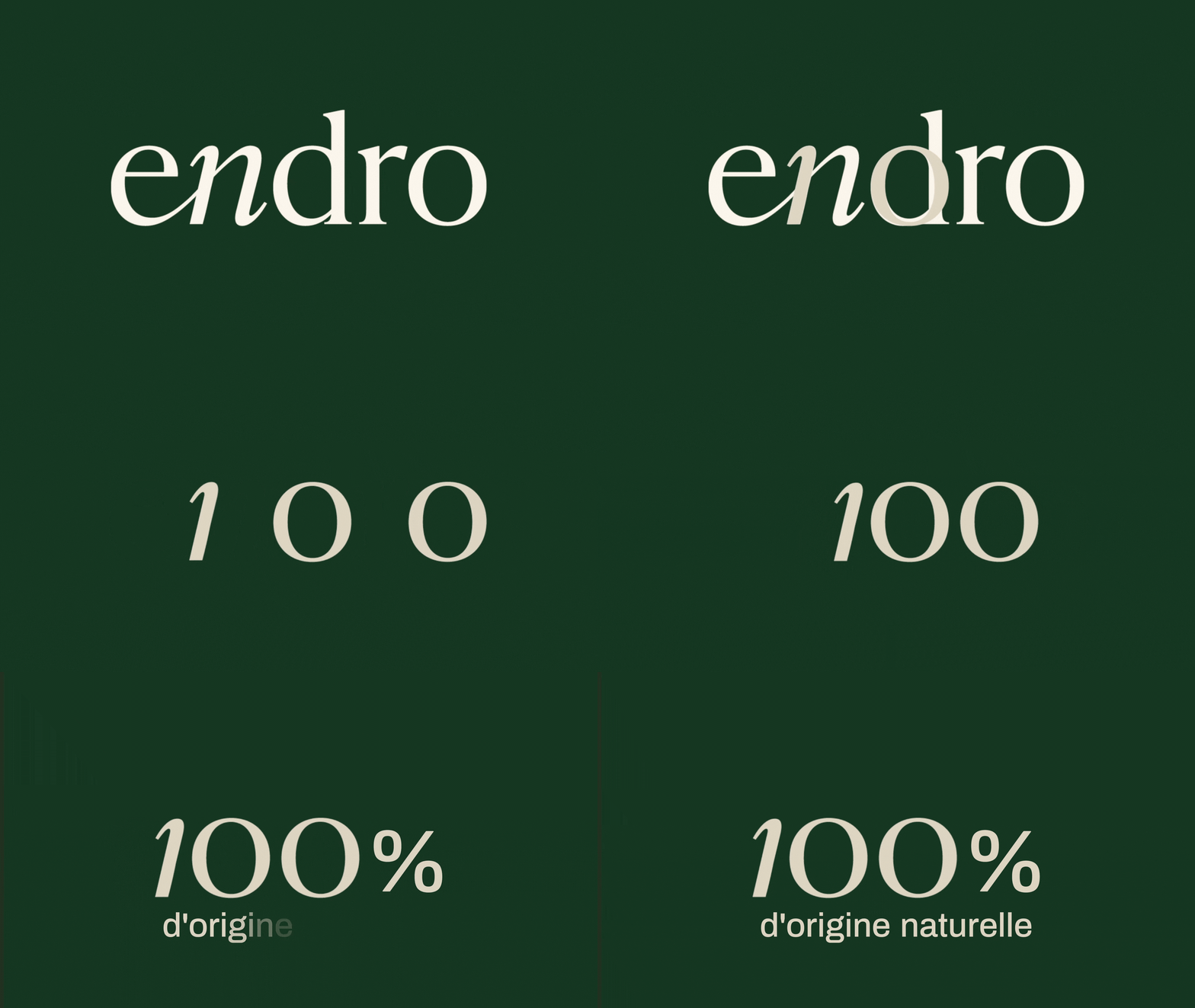
The new logo
A reflection of our natural expertise:
- A design that places our 100% natural origin at the heart of our brand image.
-
A more authoritative and elegant typography that reflects the performance of our formulas
The calligraphic N
- Emphasizes the N in Nature and Natural
- Guides the pronunciation of the name [ɛn.dro]
- Its curve brings softness and modernity to the logo, making our image less conventional and more human
The colours
- Shades drawn directly from natural elements
- A specific color code where a color reflects a skin type, allowing you to identify your routine at a glance.
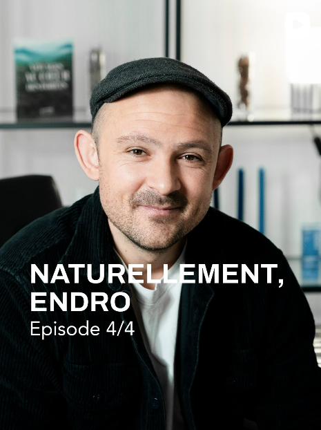
(re)discover our videos explaining the identity change, in 4 episodes.
Naturally, Endro.




Naturally,
Endro.
FAQ
Is aluminum truly a safe and eco-responsible choice for your packaging?
Yes, absolutely. The aluminum bottle we use is validated by the COSMOS standard, recognized for its requirements for natural and organic cosmetics.
It is an infinitely recyclable material, light, durable, and considered eco-responsible.
👉 Inside the bottle, a BPA-FREE varnish is applied, which ensures no direct contact between the aluminum and the formula.
In other words: no health risk, no interaction with the product, just a more practical and valuable packaging.
I've heard that aluminum isn't always recycled well. Is that true?
This is partially true, and it's important to clarify:
Aluminum is infinitely recyclable, but under certain conditions.
Not all types of aluminum are equal in terms of recyclability. For example:
-
Cans or food trays often contain a mixture of metals,
- Which makes their recycling more complex or of lower quality.
➡️ However, the aluminum we use for our tubes is pure aluminum, coated only with a bisphenol-free (BPA-free) varnish or a simple lacquer.
-
This varnish is burned off during the recycling process,
- And the material remains intact, without significant loss of quality.
- This is what is called a “closed loop”: the metal can be remelted and reused again and again.
In summary:
✅ Our aluminum is infinitely recyclable,
✅ It is part of a true circular economy approach,
✅ And it is validated by the COSMOS standard for safe and responsible cosmetic use.
Will your products in glass bottles always be returnable/refundable?
No, the new glass bottles are lacquered and silk-screen printed and therefore will no longer be returnable.
However, they remain:
- Recyclable,
- More practical,
-
More elegant,
and designed without labels (direct screen printing).
What should I do with my old returnable bottles and jars?
👉 Recycle them according to the following instructions:
Glass jars: dispose of in the glass recycling bin (without the lid).
Aluminum lids: place in the packaging recycling bin.
Bottles with pump or dropper: dispose of in the glass recycling bin, leaving the pump or dropper on the bottle.
Labels can remain, they are processed during recycling.
Why did you discontinue certain products?
- Lip balms: due to insufficient demand. They may return one day in another format, more suited to your uses. The jar format was indeed perceived as less practical and hygienic.
- Fragrance-free dermatological cleansing bar: due to insufficient demand. The sweet almond scented dermatological bar is still available and is very suitable for sensitive skin ✨
- Mint scented deodorant: due to insufficient demand. However, other jar deodorants are still available!
- Solid conditioner: due to insufficient sales and deemed impractical because of its solid format.
- Lemon-flavored toothpaste: due to insufficient demand.
-
Body scrub: the texture was indeed considered too greasy after rinsing, no longer meeting our standards of comfort and technicality.